miesinterpretation
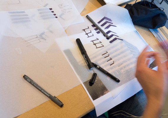
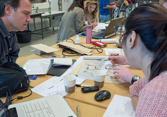
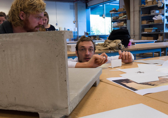
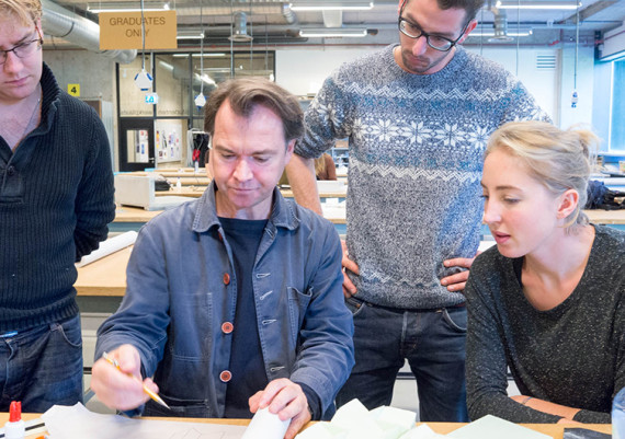
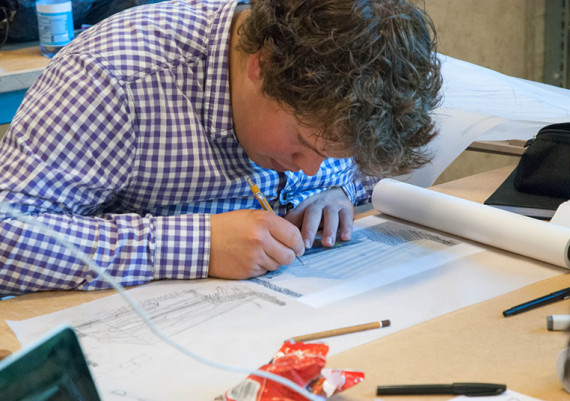
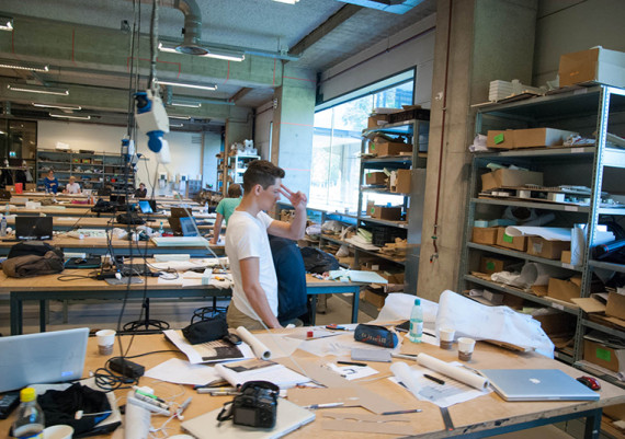
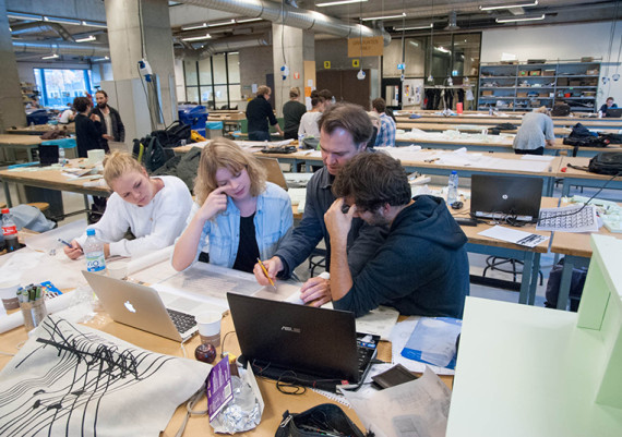
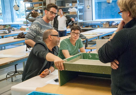
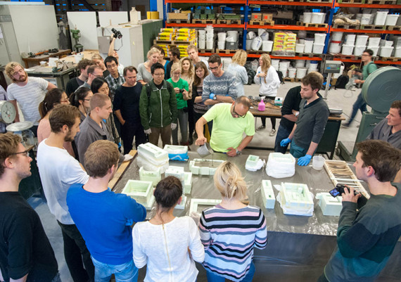
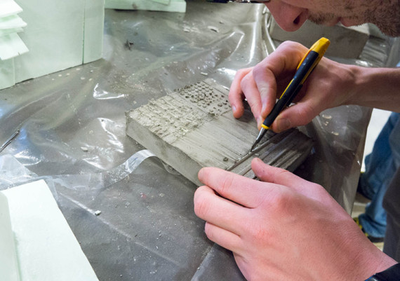
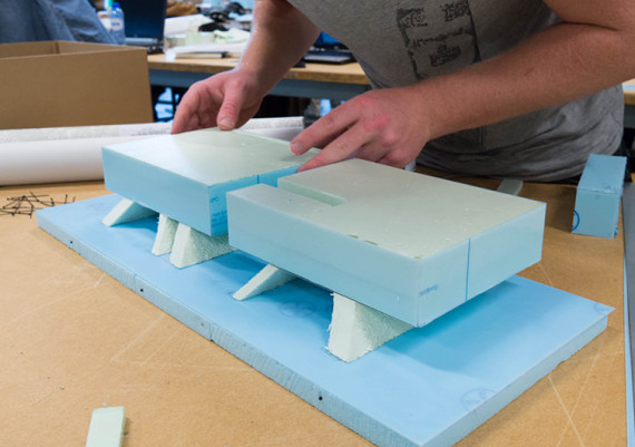
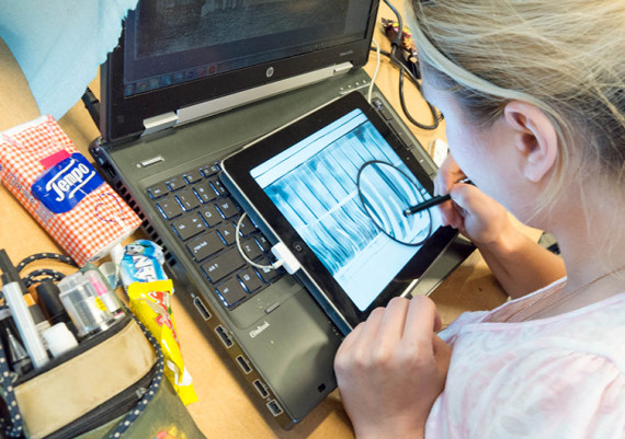
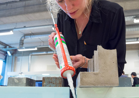
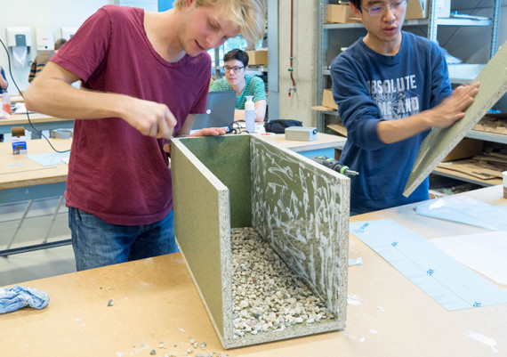
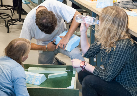
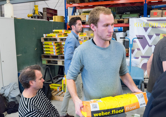
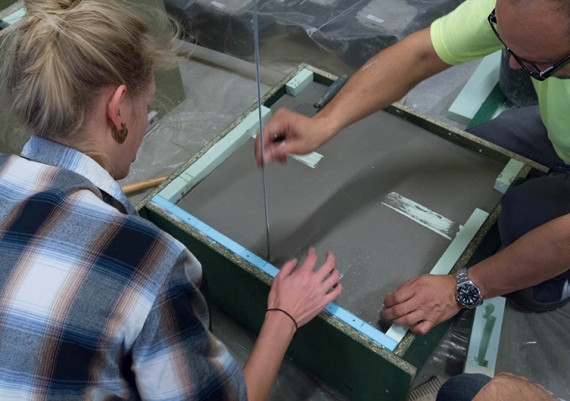
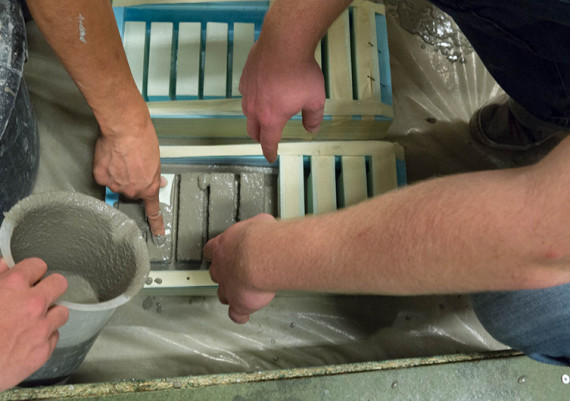
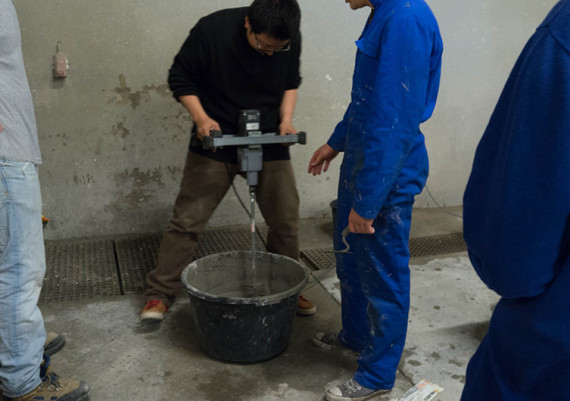
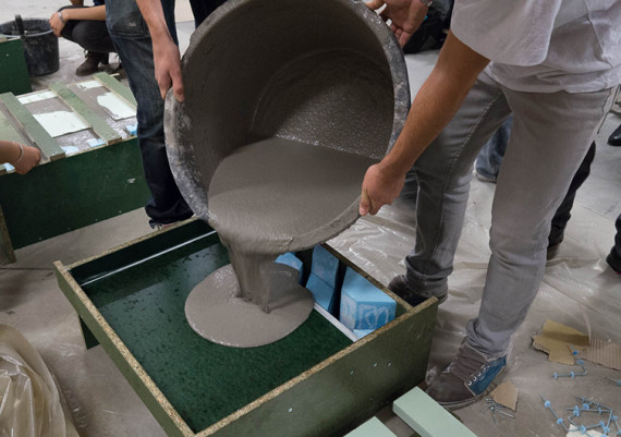
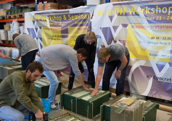
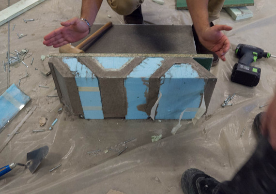
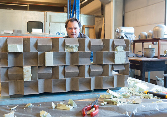
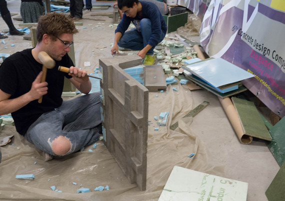
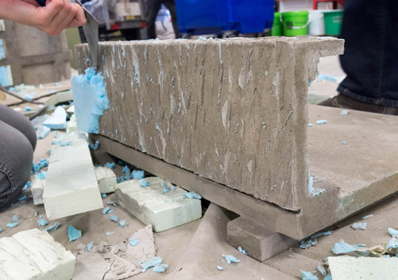
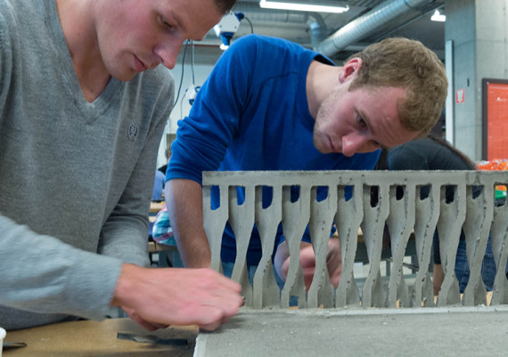
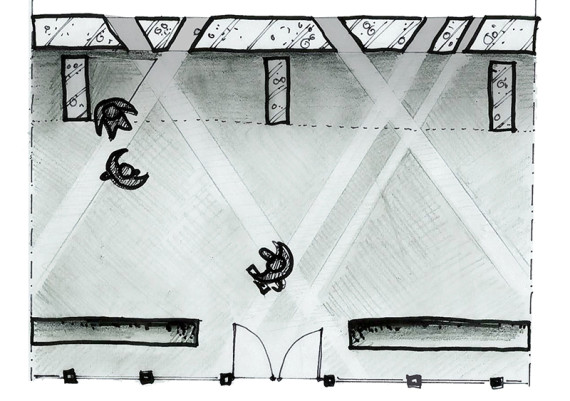
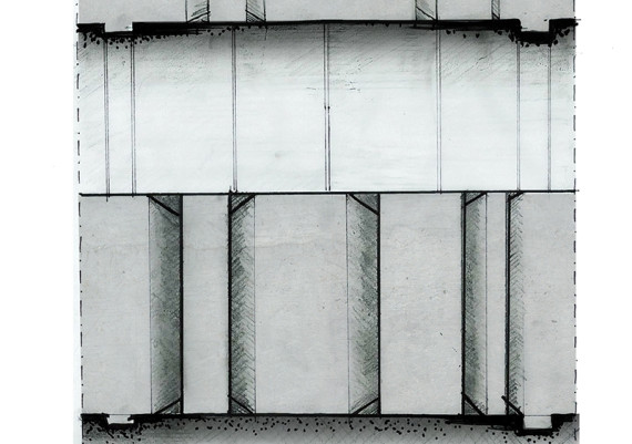
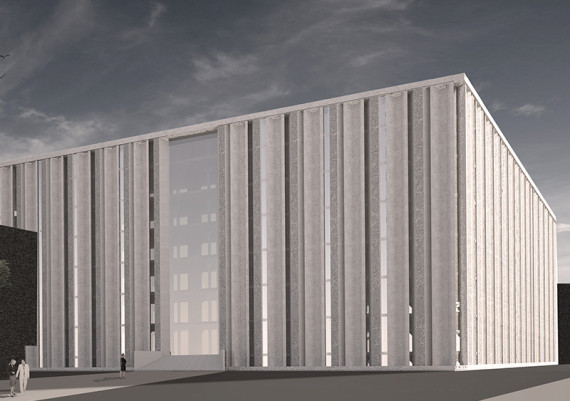
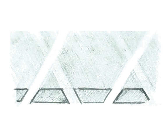
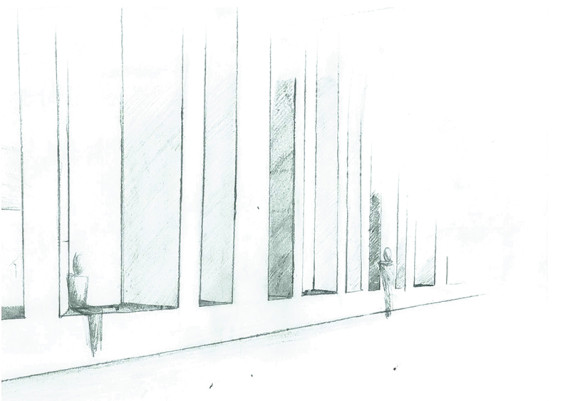
The 6th Concrete Design Competition was launched in the Netherlands with a 4-day hands-on workshop for students. In collaboration with Eindhoven University of Technology - Architectural Design and Engineering the program was set to interpret an unbuilt work of Mies van der Rohe: The Concrete Office, producing scaled concrete facade elements.
2013
concept & strategy, format, coordination & management, instructing
miesinterpretation concrete workshop eindhoven
Video impression of our 4-day workshop by one of the participants.
film & editing
Ben Kleukers
Miesinterpretation
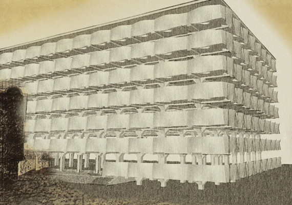
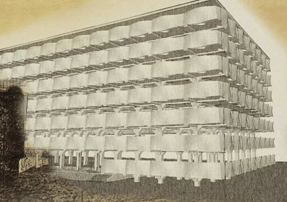
Detailing one of Mies’ unbuilt masterworks: the Concrete Office Building
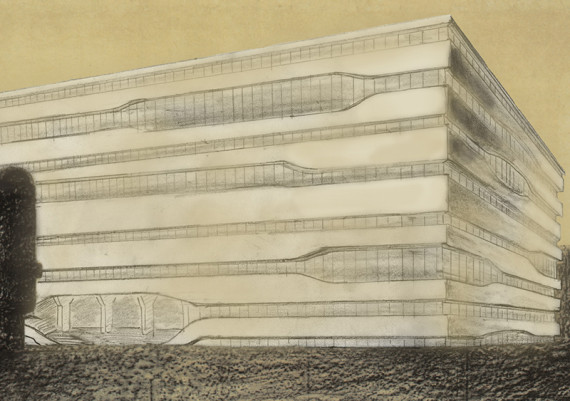
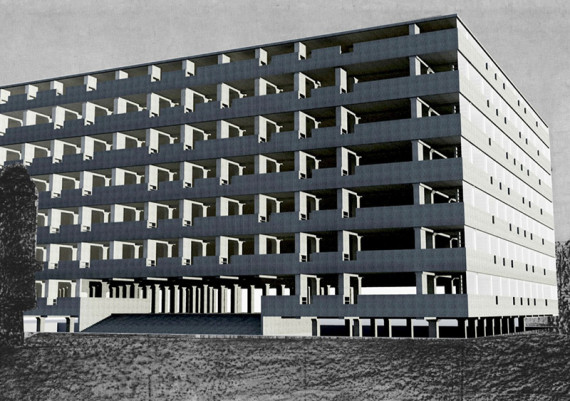
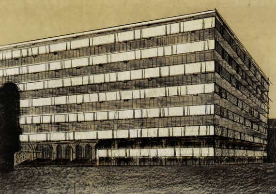
Strangely enough, the ‘buildings’ which established Mies van der Rohe’s name as a modern architect exist only as drawings. The glass skyscrapers, brick- and concrete house and the concrete office building, all created in the early 1920’s, constituted a formal break with his masters -Schinkel and Behrens- and led to an international breakthrough for Mies.
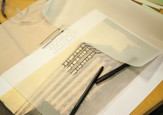
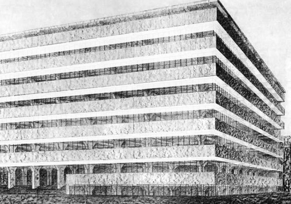
In Mies’ Critical Biography, by Franz Schulze and Edward Windhorst, the authors suggest that the architectural quality of the concrete office building, had it been realized, would be totally dependent on its detailing. The architectural detail which is completely absent in the only drawing of the building, could make it or break it.
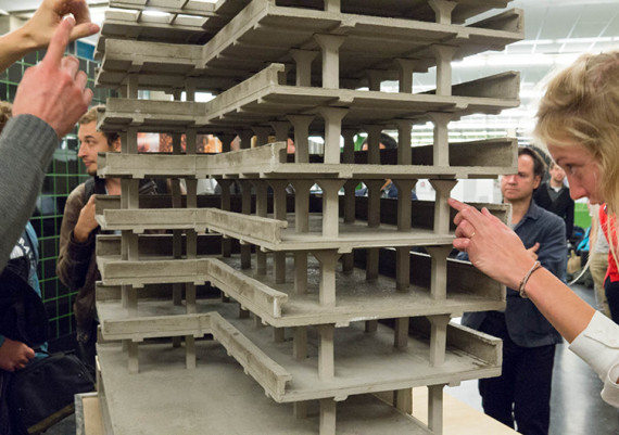
In this workshop the participating students will make a detailed design and an actual 1:10 scale model of the facade of this never built masterwork.
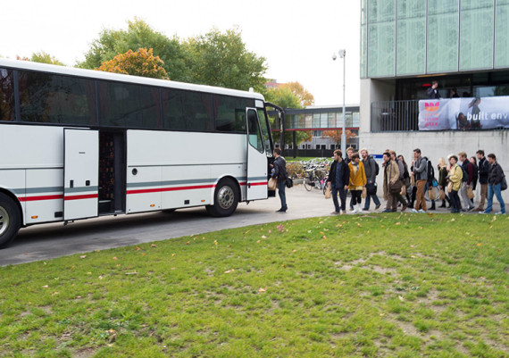
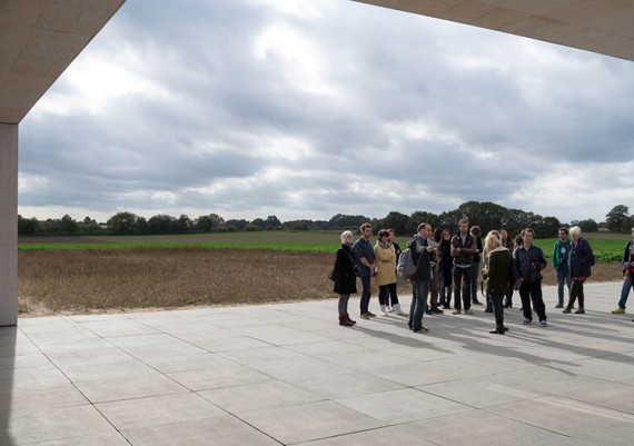
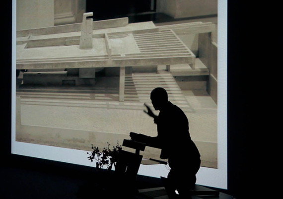
The workshop will start with a study trip to Krefeld to visit the 1:1 model of Mies’ never realized design for a golf club. Following the excursion, the participating students will attend a lecture providing an introduction to the unbuilt work of Mies van der Rohe.
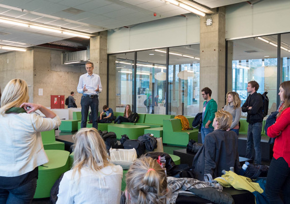
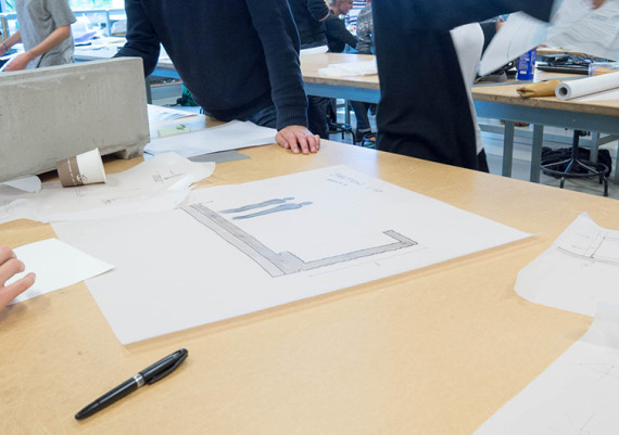
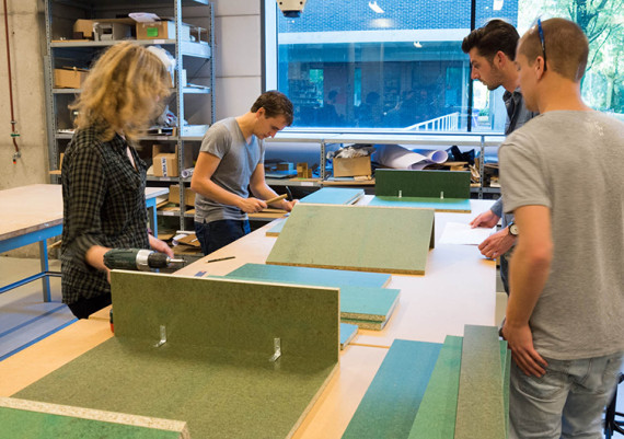
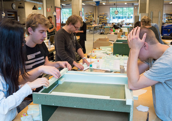
During the following days students will work on their design in groups of three. The entire process will be supervised by several tutors with extensive knowledge of Mies’ oeuvre and the use of concrete. UK architect Russell Jones will act as a visiting critic throughout the course of the workshop, in which he will show his concrete villa in Waalre as a reference.
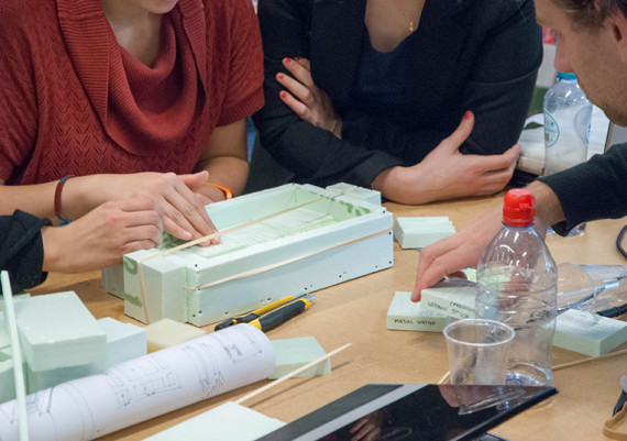
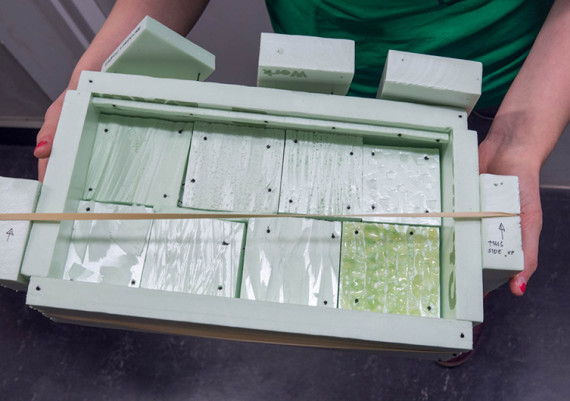
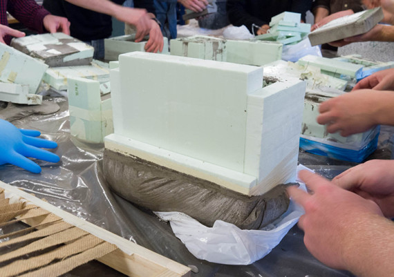
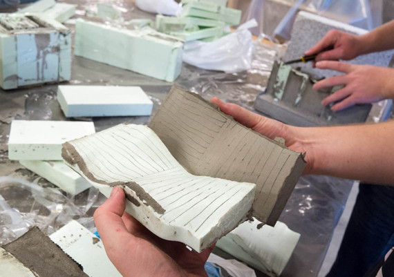
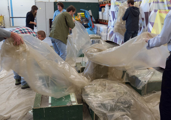
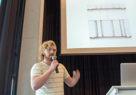
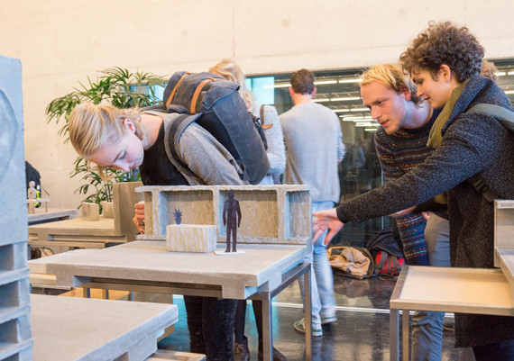
After the initial design sketches, students will make their own moulds for pouring the actual concrete scale model. At the day of the closing lectures these concrete models will be presented by the students along with panels showing the thoughts behind the design. All of the results will be exhibited during the final days of the Dutch Design Week, an international design event taking place in Eindhoven at the time of the workshop.
Jan Schevers
The Results ...
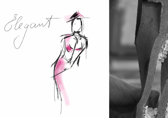
Elegant Bench Façade
Pieter Deijkers, Karolina Gajczak, Wouter Langeveld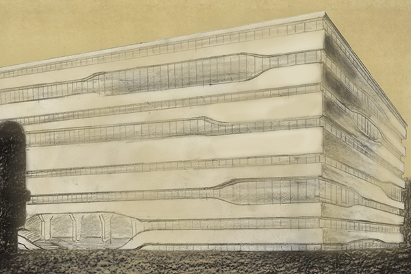
The theme for the workshop is Elegance; our idea was to create an elegant design by its simplicity.
The drawing of Mies van der Rohe has a clear horizontal expression, because of the 2 metre high slabs. He uses the high slabs to place cupboards along the façade to create an open floor space.
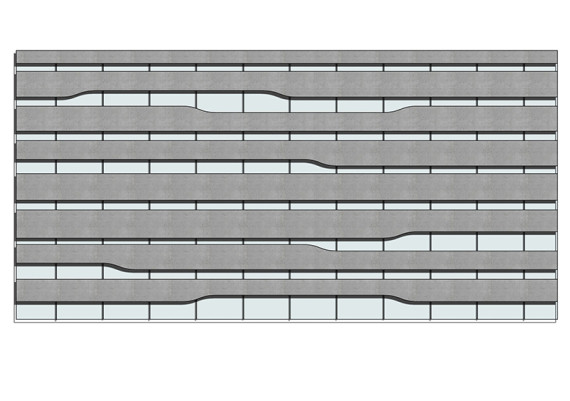
We were thinking of creating concrete lamellas with wave shape openings for bigger windows, to keep the horizontal expression. These days everyone wants to have a nice view on eye-level out of his office; lowering the slabs does this.
We took the thought of using the façade as a cupboard and created a shape that is possible to use as a bench on the lowest parts and as a stocking place, a bar or table on the higher slab parts.
Framing Mies
Dina Donch, Boris Popma, Guang Yang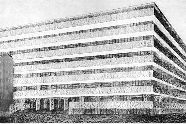
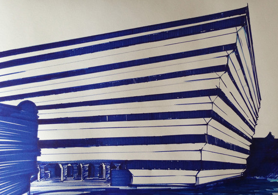
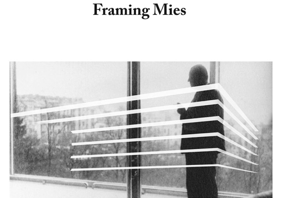
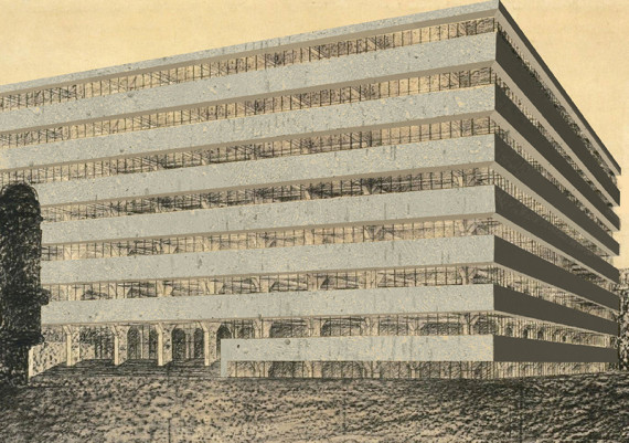
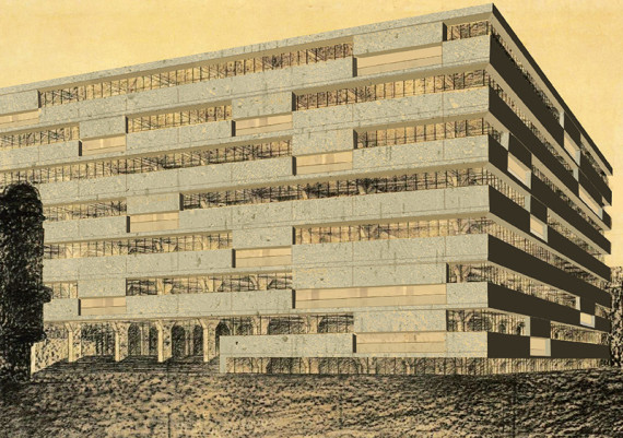
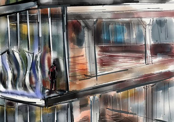
Framing Mies is a reinterpretation of the design of Mies van der Rohe’s facade design for ‘a concrete office’. The original sketch shows heavy concrete horizontal strips along the facade. This horizontality defines the face and dominates the expression. However, when looking closer at the sketch, the expressive power of the strips diminishes and slowly evolves into an overconsciousness of the concrete construction holding the building. Facade and construction become one.
The force of the expression of the building, in our opinion, lies in this first impression image, where facade and construction seem detached and horizontal concrete slabs seem to float. This image we like to express and exaggerate.
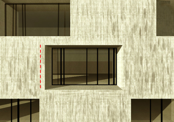
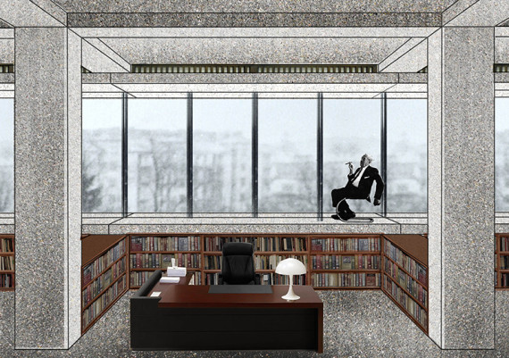
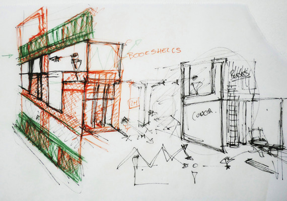
The redesign consists of a prefabricated facade and window frame element holding the distribution of the technical installations and supporting the glass. In comparison to the orginal sketch the slab has been moved to neither align with floor nor ceiling, expressing a more detached relation. The interior benefits from this shift through the
addition of a wide window-sill, acting as an interior balcony. Bookshelves are included.
The subtle modification to the design exaggerates the original expression of Mies’ sketch and suggests a contemporary implementation in which the exterior, the technical and the interior are combined into one.
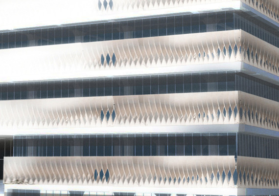
Solid Wave
Anastasia Bordian, Ben Kleukers, Alexandre de Vos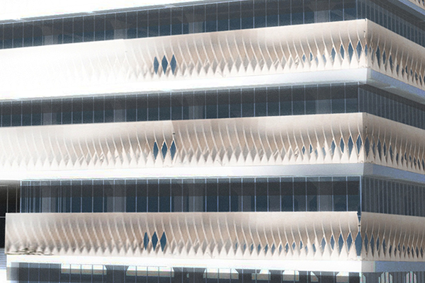
In 1923 Mies van der Rohe designed the concrete office building in a way we will not understand in the time we live right now
The hard horizontal lines, rectangular shapes and closed facade on eye level would make the building look very heavy
With the design of the Solid Wave we tried to break that hardness and still preserve the most characteristic elements of the building
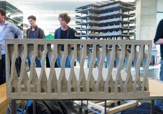
The hardness of the design is inverted into elegance by using aspects like thin and slender lines, smooth surface and gentle play of light and shadow
By opening the concrete of the straight horizontal lines the Solid Wave breaks with the hardness of the building in a special way
Twisting the concrete elements gives a movement to the mass of concrete
The concrete is used in a uncommon way and makes the building seem as light as feather
By moving the glass inside we created two different layers like Mies van der Rohe used to bring the outside in
The transparency of the concrete and the way it opens itself makes this effect even stronger
Preserving the height of the facade keeps the design close to the original idea of the concrete office building
It’s a Solid Wave
Mies between stone and concrete
Laura Cristea, Charlotte Louter, Stefan Nechita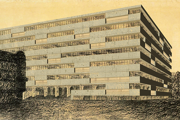
We propose to interpret Mies’ sketch as an open question. Caught in-between the experience of his father stone cutting shop, and new materials that spring from the “will of the epoch”, this continuous balancing is perhaps the key of his success.
Materials were not the only things swinging in the balance: horizontality and verticality were always at stake in his designs. In this respect, we propose decomposing the original façade thus turning the clear horizontal lines into vertical slides.
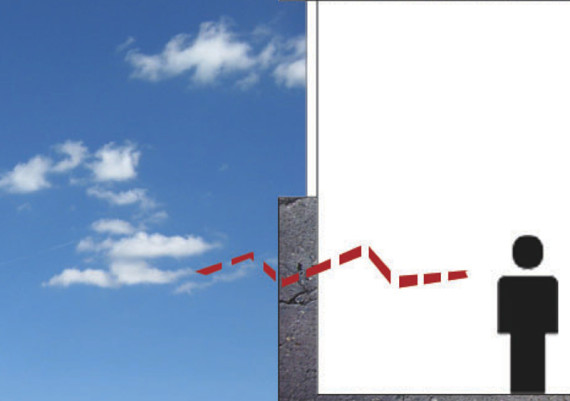
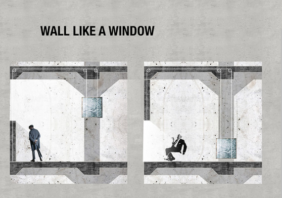
Originally designed as being 2m high, the outside concrete wall was (perhaps intentionally) depriving the workers from the outside view. We decided that the heavy concrete panel should take over the functions of a window: allowing fresh air and view in. The wall now slides up and down by a pulley system, counterweighted by a
stone block.
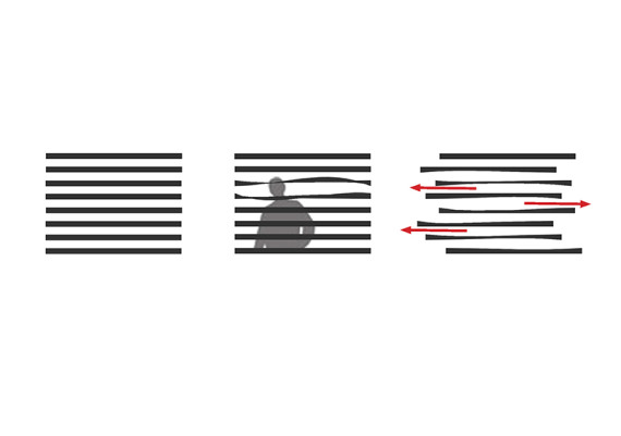
When all the white collars leave the building with the panels down, the initial image is revealed. During working time, when the building performs its duty, the façade becomes scattered by individuals’ desire of air and view that was denied in the first design idea.
Heavy, yet moving.
Rough and floating.
Opaque but open.
Modern stone counterweighted by natural stone.
Horizontality that slides vertically.
Balance.
Elegance.
Mies meets Jan
Kim Degen, Jeroen Geerards, Thijs van Tetering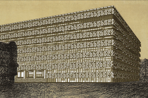
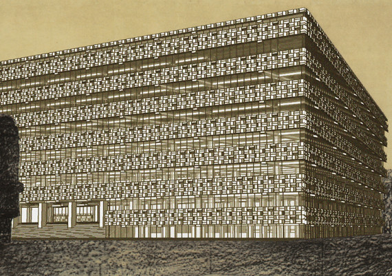
To explore the possibilities of concrete in a transformation of the façade of Mies’ Concrete Office Building, we were inspired by the work of Jan Schoonhoven. His monochromatic white reliefs from after 1955 have a sense of elegance in it.
The play with light and shadows of Jan fascinated us to utilize this aspect in the façade of the Concrete Office Building.
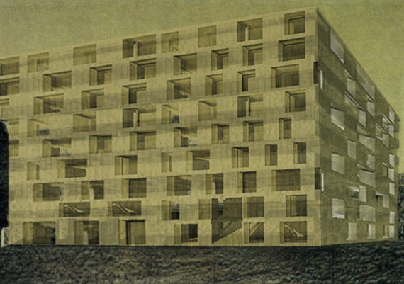
Interior and exterior are related by the pattern of the façade, which shows its negative on the inside. Just like Mies, we use a tight grid, but this time of 60x60 cm. This grid fits perfectly with the beams, thickness of the floors and size of the façade elements. The grid and composition of the façade elements continues in
the positioning of the floor tiles.
The window openings are positioned randomly and mostly on the shadow side of the concrete façade elements to obtain the monochromatic look of the façade. To achieve the horizontality of Mies’ original design, we used alternating convex and concave rows of concrete elements.
Missed-tonics
Ramona Enache, Marnix Nies, Heidi Sairanen, Andreea Tron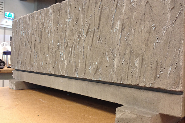
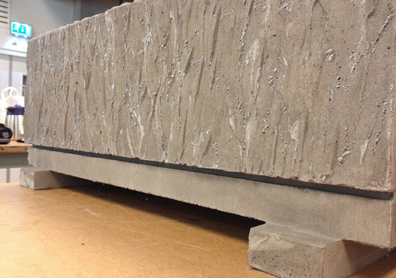
Concrete comes in many shapes and textures, as well as coal and pencil drawings differ one from another depending on the technic of the artist. What inspired us was the rough texture of the original sketch of Mies van der Rohe.
Imagining that the concrete was different than what Mies usually used in his buildings, we invested the non-load bearing wall with the visual properties that the non-structural elements generally have in Mies’s projects.
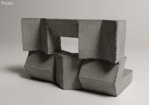
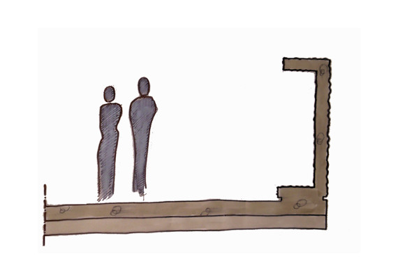
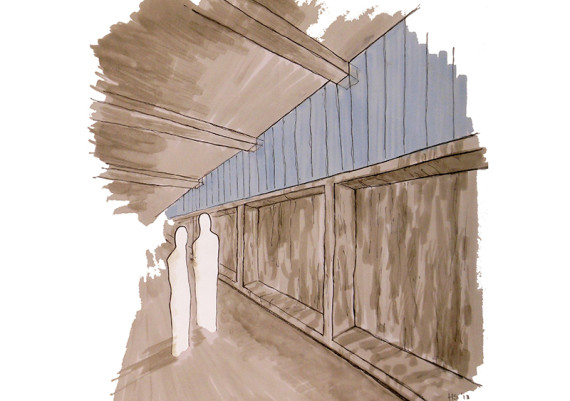
The slight separation that exists for example in between the columns and the fl oor slabs in the Krefeld Golf Pavilion has been taken further in an attempt of honestly expressing the elements of the building. Therefore, a small cut was introduced in between the wall and the slab in order to express the tectonics of the construction even more. In this way, the nonstructural wall becomes a free-standing functional element, where bookshelves and coffee-units can be placed.
A little twist to Mies
Ming Guo, Christian Hazeleger, Kars van Kesteren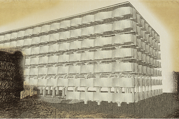
The concrete office building by Mies van der Rohe, we only know from one picture. It looks very open and strongly bounded by the horizontal concrete walls. However these walls are two meters high, so there is no view for the people who work inside. Another remarkable feature is that the beams look like going through the window and are from the front surface one with the wall.
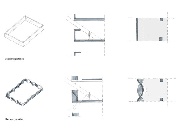
In our detail our different thought on the project is clearly shown. Our goal was to make the building show more elegance by changing the concrete shape, however without changing the horizontal focus. And not also make it more elegant by the outside but also for the people that would be on the inside. Therefore we kept the horizontal lines and accentuated them by curving them slightly which gives the concrete more interesting texture. It shows the concrete in a pure form. We tried also different things by adding texture, finally we concluded that the concrete is most elegant if it is pure without trying to get a special texture.
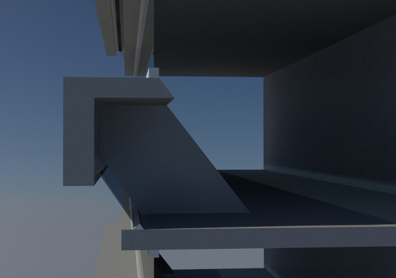
The curvature is also visible from the inside and accentuated by extending the curve into the floor by which we make an opening. In this way it is possible from the inside to look outward and make the inside more interesting. By this slight curve and opening we changed the building from Mies interpretation to our nowadays interpretation with as central theme the elegance of concrete.
Floating Concrete
Quentin Bateli, Katarzyna Romanowska, Meilin Wang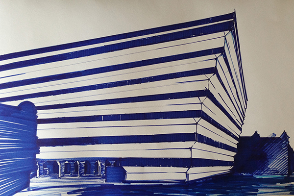
This project is the interpretation of unbuilt Mies van der Rohe’s Concrete Office Building.
The concept was to make concrete building very light but in the same time dynamic. We use the gentle slope of the building and create a concrete structure that make it more extended and powerful. To have that floating concrete effect we divided section into three pieces – 2 windows within one opening , set at an angle, and concrete slab. The whole structure of the facade is based on the 3-4 poles . The result is, that heavy concrete slabs almost hanging in the air. Thin, horizontal concrete lines emphasizes fineness of facade.
What is more thanks to the angle, we get a better view for the user. From every part of the building you can have a different views of the city.
Behind this new design you can still fill the spirit of the Mies van der Rohe’s design, you see on sketch. Simplicity, power, and beautiful horizontal concrete lines makes it unique.
Flipping for optimalisation
Mara Horj, Jesper van den Toorn, Hui Yan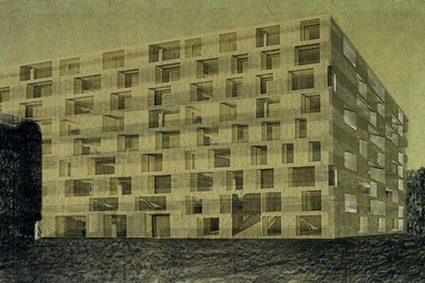
The bold statement of the concrete office building to redistribute closed elements like cabinets to the edge of the plan, results in an amazing free and open floor space to walk, work, see and communicate freely. However, as a consequence the view to the outside is completely hindered. By dividing the wall of closed functions into smaller parts flipping it vertically, and turning it 90 degrees out, we can keep the functions on the outer ring of the floor, while opening up the façade. By turning the boxes into the façade, the horizontal lines inside still remain. By this intervention we combine the powerful elements of Mies’ design (open floor plan with closed functions on the edge) with a more human friendly work environment of beautiful floor-to-floor views to the outside world. All of these changes resulting in this optimal combination, is accomplished within the thickness of the façade itself.
The missing Mies
Anna Karina Janssen, Bram Slaats, Erik Zonneveld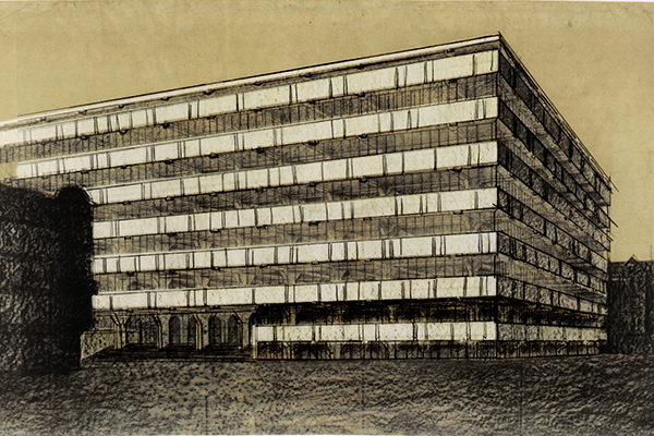
How do you interfere with Mies?
We thought it best to stay true to the original image, while replacing the original function of the space. With the electronical revolution the need for storage room is outdated. The space once used for the cabinets is now open for new possibilities By moving the routing to the facade the centre of the floor can efficiently be used as office space, wich was the original idea behind the concrete office building.
The horizontal concrete facade elements were never intended to be experienced from the inside, but without the need for cabinets the concrete will be visual. This exposure was not taken into account when designing the building, therefor some small additions to the facade were made . To enhance the possibilities of the newly created open space the horizontal concrete strips have been “sliced open” in a way that they permit light, but keep their original horizontal quality from the outside. From the inside the diagonal slices cut into the concrete slab and make the facade open up at certain given points, giving its users a connection to the outside world. The inner textures of the openings were given a rough texture which is emphasized by the natural light. The contrast to the smooth finishing on the inside further enhances the qualities of the rough openings.
Using the negative
Linda Coelingh, Andrea Dal Negro, Manon Deijkers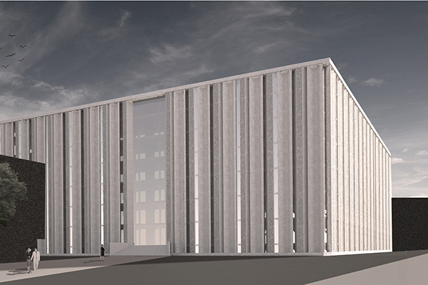
The elegance of the concrete is defined by the surface, the proportions and the light. In the concept of Mies, there is no direct view to the outside. We tried to make a new design of the facade, turning the horizontality of the building in a vertical structure, to allow a direct view for the workers and keeping the private workspaces intact. The facade consists in continuos elements, alterning different spaces and surfaces.
Reinterpreting Mies
Teije Hartman, Jan van Vlerken, Guo Guo Zhang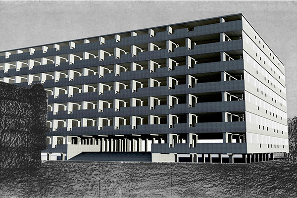
Miesinterpretation. Interpreting Mies. A theme for us and many others. Concidering Mies developed numerous unbuilt designs at a turning point in his career, those are the designs worth studying, or; interpreting. This is the essence of he full scale model in Krefeld we visited this week. Now it is up to us to make an interpretation of Mies’ work, a concrete model and an opinion about the elegant use of concrete.
What definitely stood out in Mies’ design in Krefeld is the use of spaces and views flowing rather than being framed by walls and windows. This inspired us to redesign the facade of the office building in Berlin Mies designed, but never built, in 1924.
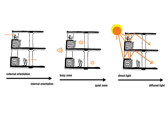
We note that times have changed and office structures have become more informal and dynamic. Also, the desire for storage and filing has decreased due to digitalisation. The moment of going to the facade is made more dynamic by implementing a small versatile space that runs along it. This space is defined by planes rather than being closed of by walls. Also, the cabinets are turned perpendicular to the facade and extended upwards. In this way going to the cabinets, either by the small stairs or the semi-open space, becomes a moment of facing away from the office space and looking outside. Also, the elevated flat plane works as a refelctor to bring daylight deeper into the building.
Our interpretation of elegance is the notion of using concrete in a pure way, in the sense that it is possible to make the entire design out of one material. The use of textures makes it possible to make different sorts of reflectivity.
6th Concrete Design Competition - Elegance
The 6th Concrete Design Competition on Elegance asks students of architecture, design and engineering to explore concrete's properties and production techniques from the position of 'elegance'. To investigate intelligent solutions where aesthetic desires are merged with physical needs, structural and economic constraints, and social demands. This competition seeks seemingly simple proposals expressing clarity in architecture and structure whilst addressing all complex issues any assignment is challenged with nowadays. It challenges to stretch the potential of the material in both monolithic systems as well as in hybrid ones. It wants participants to embrace clever deployment of concrete supporting any kind of architectural performance. To seek collaborative and inclusive solutions. To use concrete at its best, where it is used best.
Quentin Bateli, Anastasia Bordian, Linda Coelingh, Laura Cristea, Kim Degen, Manon Deijkers, Pieter Deijkers, Dina Donch, Ramona Enache, Karolina Gaiczak, Jeroen Geerards, Ming Guo, Teije Hartman, Christian Hazeleger, Mara Horj, Anna Karina Janssen, Kars van Kesteren, Ben Kleukers, Wouter Langeveld, Charlotte Louter, Stefan Nechita, Andrea Dal Negro, Marnix Nies, Boris Popma, Katarzyna Romanowska, Heidi Sairanen, Bram Slaats, Thijs van Tetering, Jesper van der Toorn, Andreea Tron, Jan van Vlerken, Alexandre de Vos, Meilin Wang, Hui Yan, Guang Yang, Guo Guo Zhang, Erik Zonneveld
instructors
Siebe Bakker, Jan Schevers
critic
Russell Jones
lecturers
Andreas Bründler, Bjarne Mastenbroek
support
Cement&BetonCentrum: Hans Köhne, Coen Smets
Christopher Ho
host
Eindhoven University of Technology - Architectural Design and Engineering: Juliette Bekkering, Jan Schevers
initiative
Cement&BetonCentrum
Eindhoven University of Technology - Architectural Design and Engineering
sponsored materials
Weber Beamix
photography
Siebe Bakker, Coen Smets
Elegant Bench Facade - group 1
Pieter Deijkers, Karolina Gaiczak, Wouter Langeveld
Framing Mies - group 2
Dina Donch, Boris Popma, Guang Yang
Solid Wave - group 3
Anastasia Bordian, Ben Kleukers, Alexandre de Vos
Mies between stone and concrete - group 4
Laura Cristea, Charlotte Louter, Stefan Nechita
Mies meets Jan - group 5
Kim Degen, Jeroen Geerards, Thijs van Tetering
Missed-tonics - group 6
Ramona Enache, Marnix Nies, Heidi Sairanen, Andreea Tron
A little twist to Mies - group 7
Christian Hazeleger, Ming Guo, Kars van Kesteren
Floating Concrete - group 8
Quentin Bateli, Katarzyna Romanowska, Meilin Wang
Flipping for optimalisation - group 9
Mara Horj, Jesper van der Toorn, Hui Yan
The missing Mies - group 10
Anna Karina Janssen, Bram Slaats, Erik Zonneveld
Using the negative - group 11
Linda Coelingh, Andrea Dal Negro, Manon Deijkers
Reinterpreting Mies - group 12
Teije Hartman, Jan van Vlerken, Guo Guo Zhang
